Sparking Interest With Music

Marketing and advertising our companies show has been a enjoyable but yet challenging time. With all the theatre performances that are already happening in the Lincoln Performing Arts Center (LPAC) we have to showcase something which is going to spark interest and attention to our potential audience members.

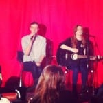
Thus being why we as a company decided to hold an Acoustic Night which was held on 1st of May at the Lpac. This idea to hold an Acoustic Night arose from what our company was about , we take pieces of text, lyrics and speeches and change and deliver them in different ways taking them out of their original context. This linking to the acoustic night because our performers were taking songs and doing covers of them in their own unique way. For example Toxic by Brittany Spears was sung in a slow and soft way which completely contrasted the songs original performance.

43

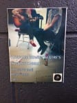
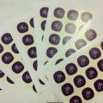
To gain interest in our acoustic night we created posters and advertised on social media such as creating an event on facebook and tweeting about it on twitter. We also thought it would be nice if our audience members could take away a small souvenir which would help spread the word of our company but also be a nice way of them remembering us .”you may think its a waste of time to plan much of anything on a few dollars and cents, but if you follow some simple rules you’ll be suprised how much of a splash you can make on a tiny budget.” (Wallis, 2005,p84) However little money we had we wanted to make an impact on our audience so we decided to get some stickers printed. This was a relatively cheap marketing tool which we could stick on anything from people to posters. And our audience at the acoustic night loved them, they all thought that they were a nice touch to a chilled evening of music.

2

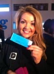
The actual evening went really well we had an audience of around 30-40 and everybody had a great time . Donations to our theatre company were made from audience members and we raised some money which would go back into the costs of our performance which we couldn’t be more delighted with. This night enabled to also promote our show ‘Take Me By The Tongue’ May 29th and people were able to buy their tickets at the Acoustic Night which also really boosted our sales .

1


Wallis, L. (2005) In Good Company. Currency Press: Australia. P.84

Logo Design

Being part of the marketing team one of my aims was to design and create a logo for our company. Having the theatre company name “Hand Me Down Theatre” at hand to help, I went away to research and develop my ideas further. This however was quite a difficult task as the logo needed to be linked with our companies aims yet also be creative an eye catching. Researching into other popular theatre companies logo’s what I found out was the more simple the logo , the more I felt it caught my attention, as I was intrigued as to what sort of theatre they made.  As example, Filter Theatre has a clean cut white 11 sided shape with filter in red to one side.
The shape of the logo was an aspect which I wanted to play around with.  To start with as a company we discussed ideas and thoughts about what we wanted the logo to look like. Sketching ideas down was a way I could create and thought track all my ideas down . However my sketches were not professional looking enough so the production team thought about using Logo Design websites where you could use there ready made logos for a small cost.
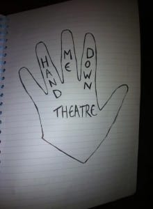
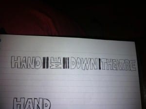
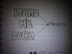
These are a few of my original designs
521

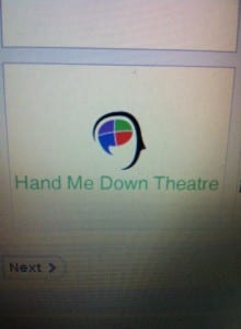
These are a few of the designs from the logo website
6 7 8

In the end we decided to go with this logo we felt that the text was catchy and that the random letters linking with our collaboration of different texts.

Picture7Picture6

Having a navy and green colour scheme we felt would catch the viewer’s eye. However after showcasing this logo on our Facebook, Twitter and Instagram, people gave us feedback. Why is it in the shape of glasses? Looks like an opticians! Why the use of letters? All of this feedback was very useful and discussion took place to try and change and progress from this.

A friend of one of the company’s is a graphic designer which was a great person to know at this time, discussing our ideas to him he was then able to create something which was professional, sharp and bold. He did this free of charge which was highly beneficial to us as the first logo had cost £11.00 so all in all, we hadn’t really wasted much of our budget. This whole process is about trial and error, developing along the way. The more feedback we get the more we are able to develop. Our new logo is edgy, simplistic but eye catching and we have had good feedback and comments on it already .

PROFILE PICTURE